Responsive design delivers content that’s correctly formatted for your screen size.
Usually this means that page content reflows to fill the available screen width. Inline images shuffle position as the text line lengths change.
Using a Single Image Can be Great
Occasionally you may want to compose your page content as a single image. This can be great for maximum layout control because you nail down the fonts, the composition, the image size — every aspect of the infographic. In short, you create an image for your page.
Using a Single Image Can be Bad
There’s a potential trade-off when using images. You can run into problems with images because your text and layout are all built to a fixed size. This means content can’t reflow to fill the various screen widths nicely. The benefits described above can become a liability because the image can’t take advantage of responsive design.
Here’s the Problem with Many Infographics

If you’ve spent any time looking at infographics created as images, you’ve probably noticed the problem with many of them.

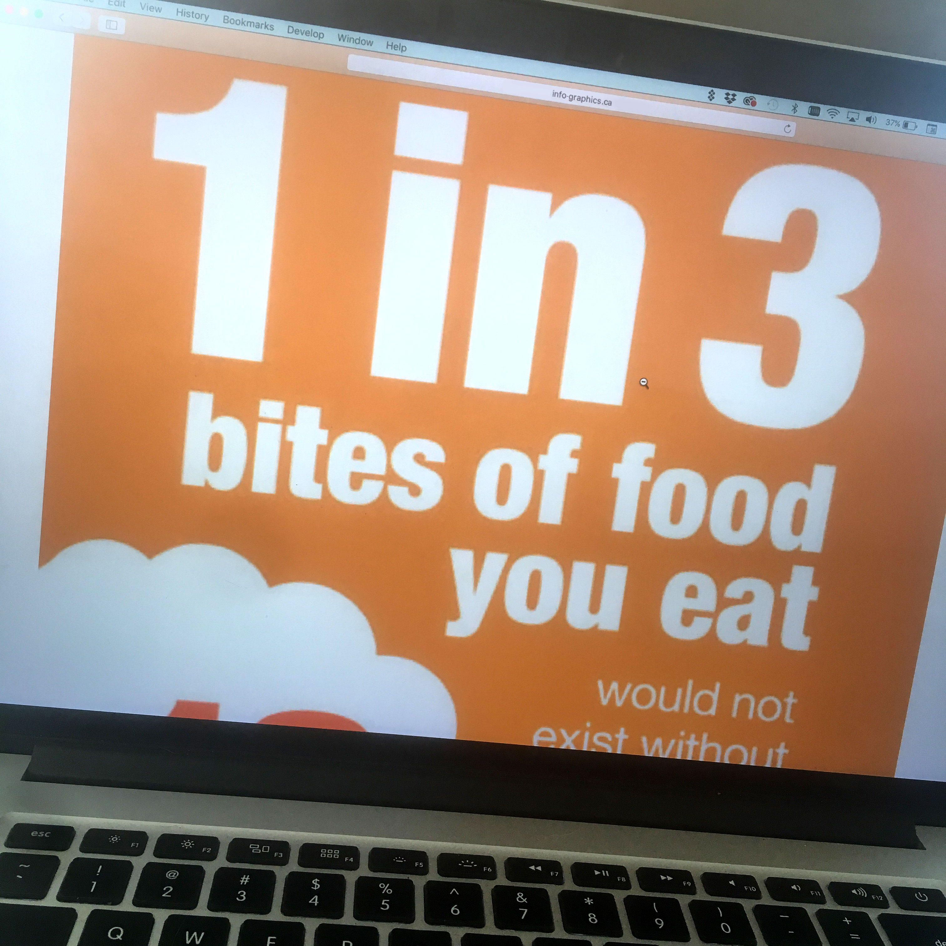
When you create the image for a phone screen and view it in your desktop browser it will either display as a narrow vertical strip or scale up to fill your browser window with crazy large text sizes and very coarse resolution.
Create the image for a big, desktop browser and view it on your phone screen it will be scaled down to fit the phone. If that happens it’s illegible on your phone.
Neither option works.
Our responsive design script solves that problem.
Here’s how it works. We prepare Small, Medium, and Large (S, M, L) versions for each image and our responsive design script detects your screen size and loads the right version. The examples below are the top portions of three files explaining the volume of crops pollinated by honey bees in the USA. All three are the same resolution, but made to the right widths for each screen size — phones, tablets, and desktop.

Check out our honey bee example below on different devices to see what we mean. Or scale your desktop browser window from wide to narrow to see how the images change for each screen width.


